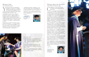
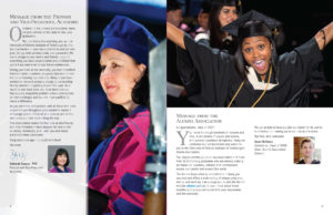
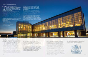
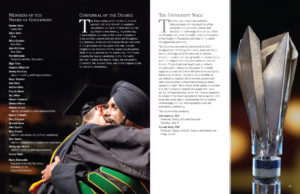
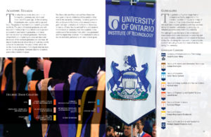
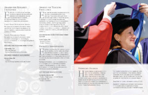
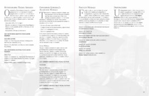
After years of the university having a plain, text-only program for convocation, the Registrar’s Office (R.O.) requested a “glossier” redesign to create more of an engaging souvenir of the event for graduating students and their families to remember the day.
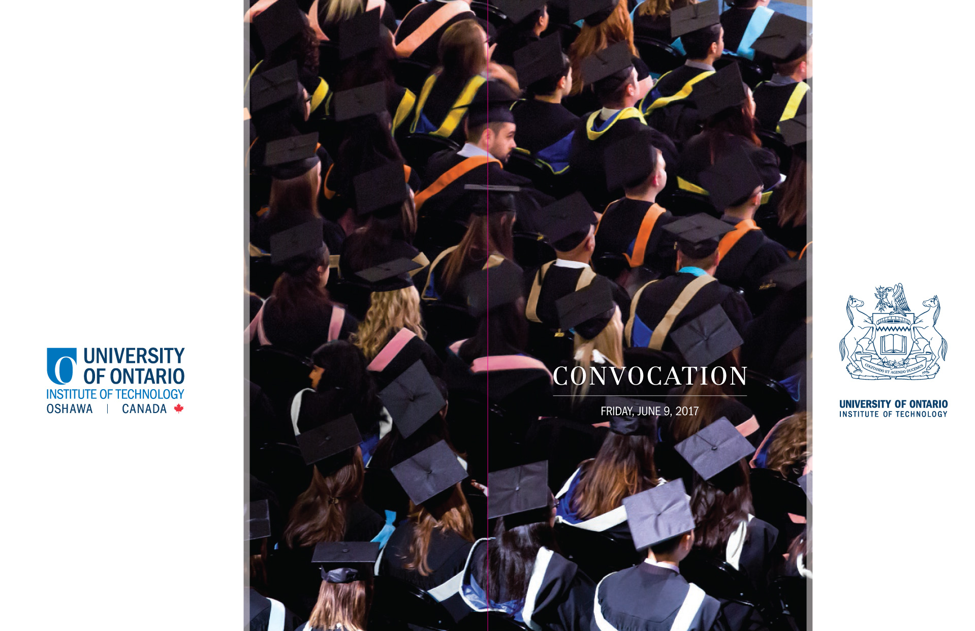
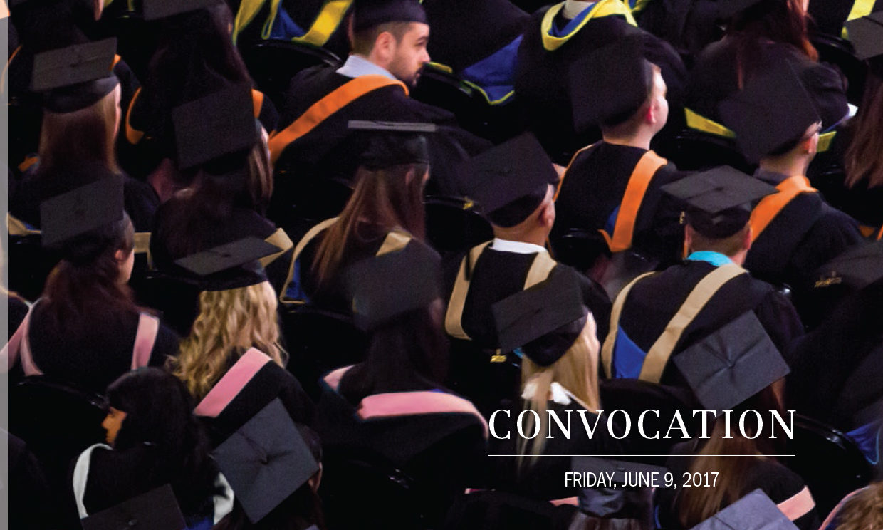
The program cover spread. The original image was challenging, taken in very low light in a split second at the end of the ceremony (graduates don’t wear their coloured hoods until after they’ve crossed the stage). The hood colours were also manipulated to represent all of the faculties in one image (you would never normally see so many different colours at one ceremony). Apologies to any of the Faculty of Education graduates pictured who look like they’re now wearing an Engineering, Business or Nursing hood.
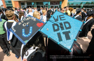
I provided three layout options for the R.O. to choose from, with all three drawing on some of the amazing event images that our photographers had captured over the years. Only a few of these shots had ever been used before, so it was great to finally get a real opportunity to show off some of the most fun, celebratory images in our archives that really captured the end result of our students’ university experience was all about.
And there were absolutely no images of grad caps being thrown into the air!

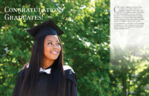
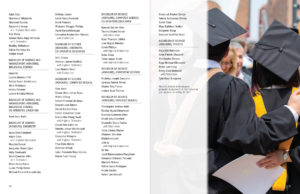
The inside-back cover spread—a great image to round off the ceremonies.
The venue’s low light conditions and coloured gels on spotlights meant that most of the images required a lot of editing to compensate for grain and heavy colour casts. Thankfully, our in-house photographer was on hand to adjust some of his RAW files where necessary, and I have a good relationship with all of the external photographers that we had used for other years. Plus, I relish a good Photoshop challenge!
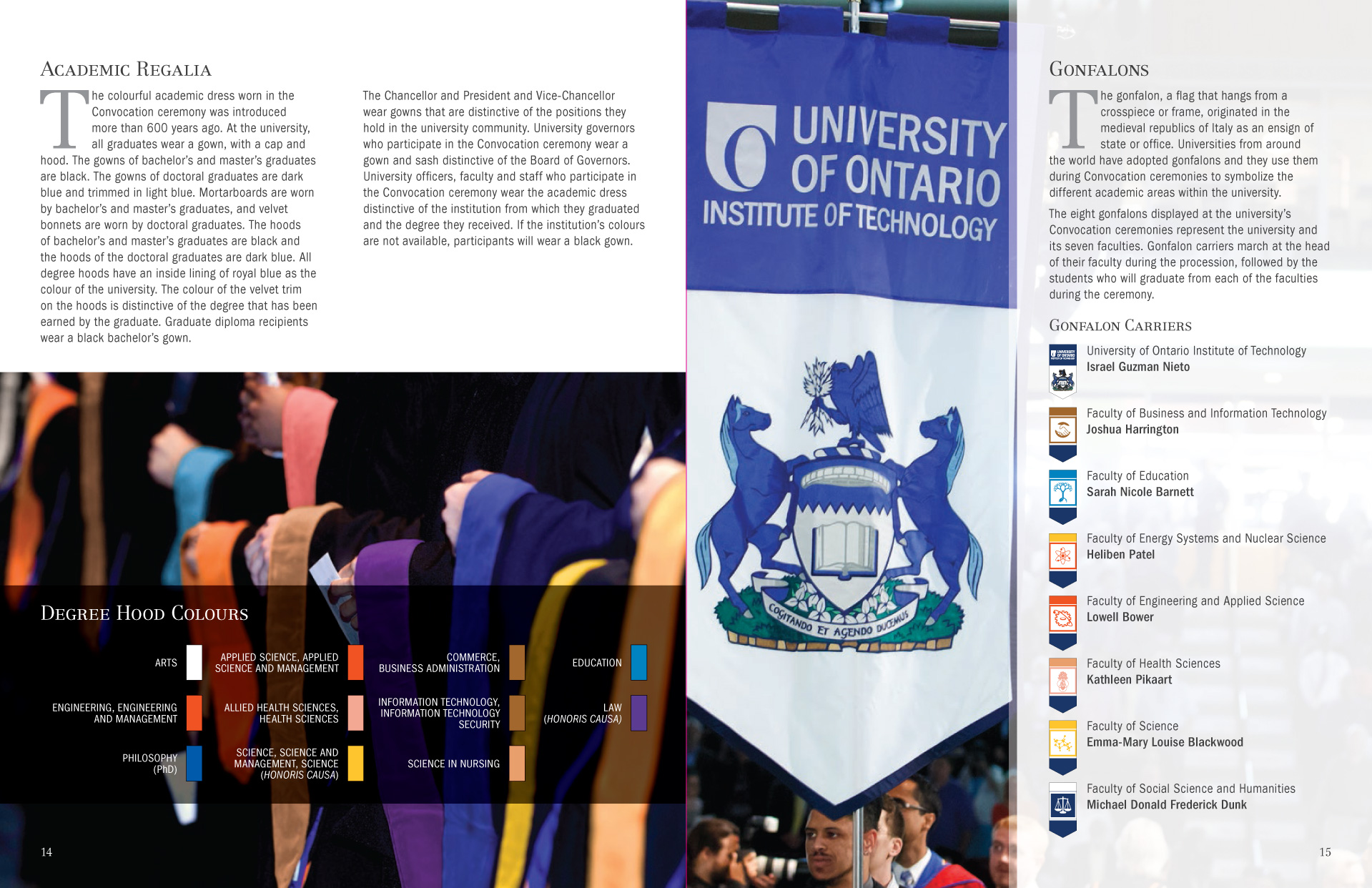
The image on the left-hand page was adjusted from all-orange hoods to feature an example of all of the hood colours.
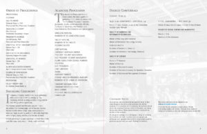
Convocation is always a challenging project—creating two separate programs for each day of ceremonies, usually with different page counts, and a very short timeline between receiving the final list of names and degrees, and the final art going to print. Thankfully, I had developed a solid set of InDesign styles that I was able to adapt from previous years’ files that made flowing in the final data that much easier.
I’m very happy with how this project turned out and, hopefully, it added to the graduates and their families’ enjoyment of the event.

